
The Sea of Sameness | Episode 3: The Caregiving Copy-Paste
- Mar 18
- 1 min read
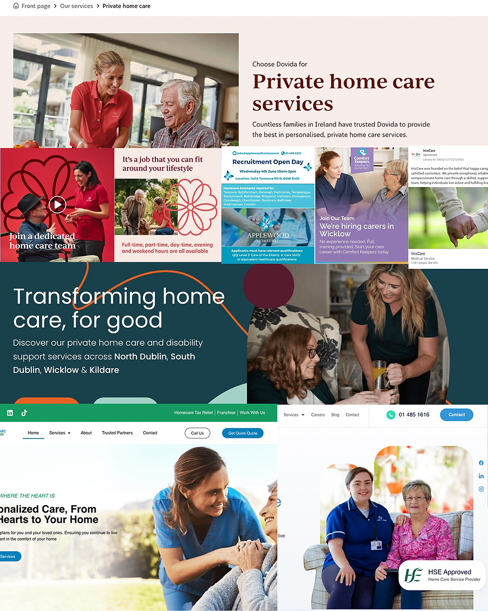
Take a look at the image below. These are different private home care providers in Ireland, yet the visual DNA is virtually identical.
The imagery features warm photography of smiling carers with elderly clients.
The messaging uses reassuring language focused on personalisation, dignity and independence.
The aesthetic relies on similar soft colour palettes and layouts designed to project trust.
The Emotional Blindspot
For a family in the middle of an emotionally charged search for care, it is genuinely difficult to tell one provider from another. This often happens under time pressure. When every brand uses the same visual shorthand, they stop being individual companies and start appearing as a generic service.
The Commercial Cost of Uniformity
This is not just a branding problem; it is a commercial one. When a category looks and sounds uniform, families do not credit the company behind the ad. Instead, they default to whoever already feels most familiar.
This is where misattribution becomes a real issue. Smaller providers end up investing in communications that quietly reinforce the market leader rather than building recognition for themselves.
Building Mental Availability
The home care market in Ireland is growing, and so is the competition. The providers who invest now in building genuine mental availability will be much harder to displace later. This means being easily thought of and confidently chosen.
Is your brand offering a unique promise, or are you just blending into the background of the category?


Comments